-
Jordan Mitchell
- No Comments
JPEG and Web Performance: Finding the Balance Between Clarity and Speed
Most slow-loading websites aren’t held back by code and they’re dragged down by heavy images. If you’re using JPEGs (as many sites still do), optimizing them properly can make a world of difference: faster loading times, lighter server load, and a better experience for users across the globe. You don’t need to be a developer to get this right. All it takes is a clear workflow and the right approach to image selection, compression, and delivery.
• Resize and optimize images before uploading not afterwards.
• Use lossless and lossy compression wisely to balance sharpness and file size.
• Enable responsive images (via
srcset and sizes) for flexible display.• Serve JPEGs through a modern CDN with caching, lazy loading, and HTTP/2 or HTTP/3 support to boost global delivery speed.
Many tools now support seamless conversions between formats, including Pdf to jpg, making it easier to maintain efficient workflows across teams and devices. Small improvements at this stage can result in big performance gains for your site over time.
Why JPEGs Still Matter for Performance
JPEG has been the web’s image format of choice for decades. Thanks to its lossy compression, it reduces file size while keeping images visually acceptable. Still, over-compression can blur details, while under-compression bloats files. The goal is to strike the right balance based on the context, product listings, social graphics, homepage banners, and more.
Speed is no longer a bonus for it’s expected. Users click away if a page takes too long to load. This behavior spans every continent, affecting blogs, marketplaces, and enterprise websites alike. The good news? You control a major part of it by managing the images you upload.
Image Dimensions: Don’t Make the Browser Do All the Work
Uploading a 4000-pixel wide image just to display it at 1200 pixels wastes bandwidth. CSS may shrink it visually, but the full file still loads. Always export images at the exact size needed for your layout. If the content area maxes out at 1280px, don’t go beyond that. For thumbnails, create separate versions around 320px.
Audiences around the world use everything from 4K monitors to mobile phones with limited data. This is where responsive images come in. By using srcset and sizes in your HTML, you allow browsers to choose the most appropriate file. This reduces over-delivery and keeps downloads lighter.
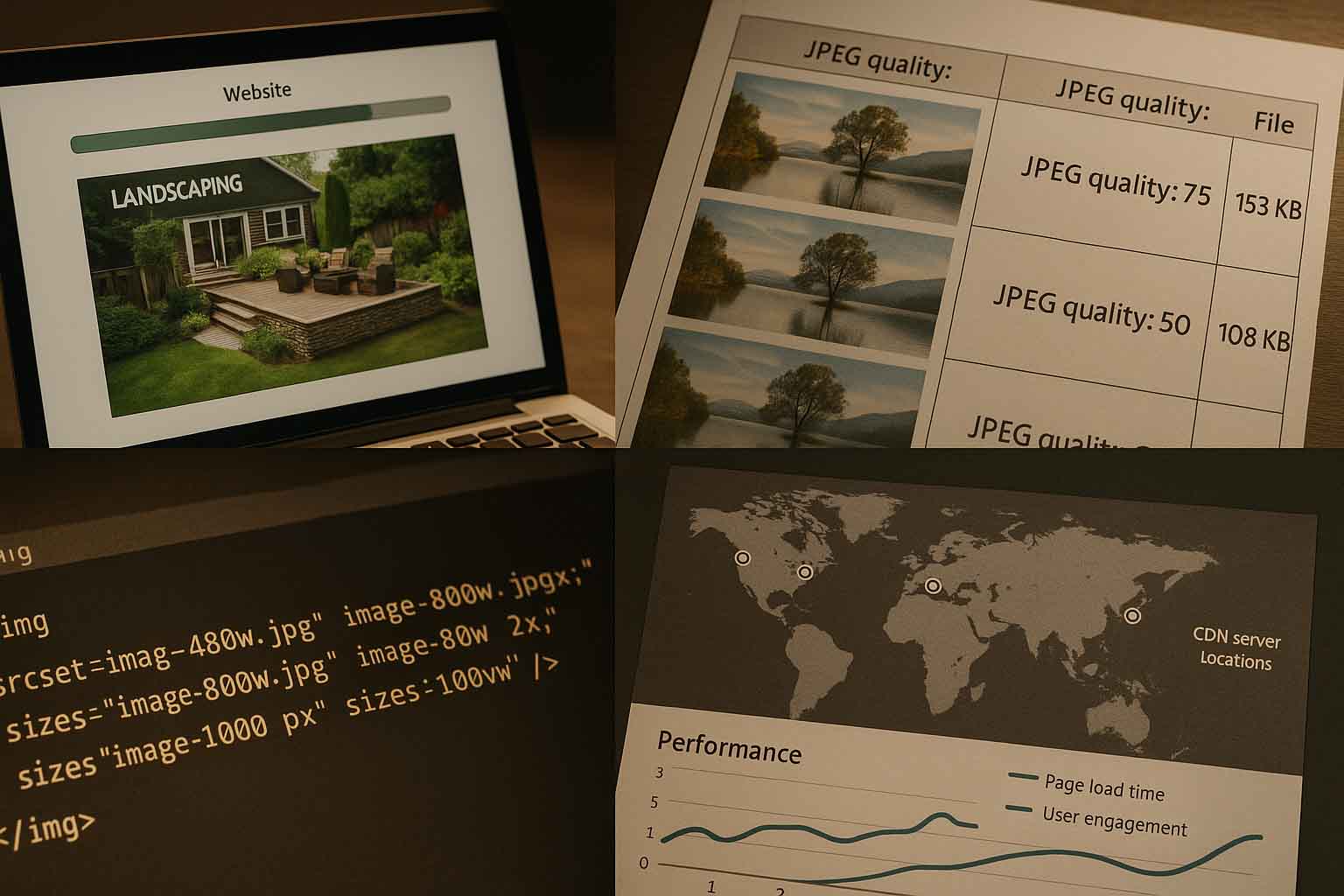
Choosing the Right Quality Setting
Most image editors offer a quality slider from 0 to 100. But higher isn’t always better. Often, the visual difference between quality 90 and 80 is minimal, yet file size drops significantly. A good starting point is 70–85. Adjust based on the type of image, fine gradients or faces might need a higher setting; clean product shots can go lower.
There are also tools that adjust compression based on what the eye can’t easily detect. These are ideal for batch processing in large libraries.
Lossless vs. Lossy Compression
JPEGs are typically lossy. However, some tools apply lossless optimizations afterward by removing metadata, reordering encoding structures, and more. Use lossless steps after applying lossy compression. For example: export from an image editor using lossy settings, then run the file through a lossless optimizer before uploading.
Chroma Subsampling and Color Space
JPEG supports color subsampling like 4:4:4, 4:2:2, and 4:2:0. The default is usually 4:2:0. It’s compact and visually fine for most uses. But for images with bold colors or precise graphics, 4:4:4 might be better. Test to see the trade-off between size and clarity.
Stick to sRGB for color space. Converting from Adobe RGB or ProPhoto ensures images won’t appear too faded or oversaturated in browsers.
File Names, Metadata, and SEO
Optimization isn’t just about pixels. Use descriptive file names like laptop-keyboard-closeup.jpg instead of IMG_0032.jpg. Keep it simple and relevant, avoid keyword stuffing.
Add proper alt text to support accessibility. Describe what the image shows for screen reader users. It helps with SEO and ensures inclusivity.
Remove unnecessary EXIF metadata if you don’t need it. This reduces file size and privacy risks. Metadata often includes camera model, location, and more.
Automating the Process
If you upload images frequently, manual optimization gets tedious. Set up automation in your CMS. WordPress has plugins that resize, compress, and apply lazy loading automatically. For custom stacks, use build tools or scripts.
Define image standards for your team, target dimensions, quality ranges, and preferred tools. This consistency improves site performance and visual branding.
Choosing the Right Tools
You have several options:
- Desktop tools: Affinity Photo, Photoshop, GIMP
- Command line tools: jpegoptim, mozjpeg, guetzli
- Cloud services: On-the-fly optimization via URLs and CDN integration
Your choice depends on your workflow:
- For solo designers, desktop tools are ideal.
- For developer teams, use CLI tools with CI/CD integration.
- For global delivery, CDNs with real-time optimization are most efficient.
Delivery Tactics: CDN and Caching
Even a well-compressed JPEG loads slowly if hosted far from the user or lacks caching. CDNs solve this by storing files closer to end users.
Set proper cache headers like Cache-Control and ETag to enable reuse. Use HTTP/2 or HTTP/3 for better performance.
Since many users rely on mobile data, apply lazy loading. The loading="lazy" attribute in HTML5 delays image loading until needed, saving data.
Progressive vs. Baseline JPEGs
Progressive JPEGs load with a blurred preview that sharpens gradually. Baseline loads top to bottom. On fast networks, the difference is small. But on slower ones, progressive gives a better impression. Check your tools for a setting to enable this.
Progressive encoding takes slightly longer to generate but offers a smoother experience.
Keep Monitoring Performance
Image optimization isn’t a one-time fix. Use tools like Lighthouse, WebPageTest, or SpeedCurve to track metrics like Largest Contentful Paint (LCP).
Use Real User Monitoring (RUM) to capture performance from actual users in different regions. Set alerts when new image uploads exceed size thresholds.
Before launching campaigns or seasonal pages, audit all new visuals to keep performance consistent.
Why JPEG Still Has a Place
Modern formats like WebP and AVIF offer better compression. So why stick with JPEG?
Compatibility: Some browsers and devices still lack full support for newer formats.
Workflow: Many creatives are used to JPEGs in their existing tools.
Still, you can serve WebP or AVIF as primary formats and fall back to JPEG when needed. Until support is universal, keep optimizing JPEGs.
Simple Checklist for Teams
Use this as a quick reference or training guide: always export images at their exact display size, select a quality setting based on visual evaluation, typically between 70 and 85 to apply responsive markup using srcset and sizes, and ensure CDN caching, lazy loading, and performance monitoring through metrics like LCP are properly in place.
Real-World Scenarios
A startup in Berlin selling digital art reduced homepage image payloads from 5 MB to 900 KB by creating multiple image versions and automating delivery. Their conversion rate improved.
A São Paulo news site automated optimization in their CMS: stripping EXIF, enabling progressive JPEGs, and applying lazy loading. Their servers handled spikes in global traffic with ease.
An e-learning platform in Nairobi accepted some image graininess to prioritize fast loading. With lighter JPEGs, users on slow connections stayed longer and viewed more content.
Accessibility and Design Clarity
Alt text helps users with visual impairments. Clear descriptions improve understanding through screen readers.
Readable overlay text also matters. If an image loads perfectly but the text on top isn’t legible, the user experience suffers. In some cases, it’s better to separate text layers instead of embedding them in images.
Ethics and Data Safety
In some countries, privacy laws require extra care. JPEG metadata can contain GPS data. If you don’t need it, remove it.
Ensure you have the right to use every image. For stock photos, follow license terms. For user-generated content, clearly define terms and permissions.
Test Visuals Across Devices
What looks great on a calibrated office monitor might appear off on a budget phone. Test your images on different devices and brightness levels. Low-end screens might reveal artifacts invisible on high-end displays.
Start With Optimization in Mind
It’s easier to design lightweight visuals from the beginning. Avoid using oversized backgrounds if they’ll just be blurred. Create guidelines for focal points, exposure, and compressible styles to minimize editing later.
Use Real User Feedback
Once live, measure real performance. Identify which pages have poor LCP. Compress the top 10 largest hero images and see how it affects bounce rate.
If no quality complaints arise, keep the smaller files. If you get feedback about blurry images, adjust accordingly. Let data guide your decisions.
Building Brand Trust Through Visual Consistency
Optimization isn’t just technical. It affects how professional your brand appears. Clear, fast-loading images inspire trust.
During global events, users interact with banners, speaker photos, and sponsor logos. If these assets slow the site down, it reflects poorly on your brand. If they’re seamless, the experience becomes memorable.
Final Pre-Publish Checks
Before publishing, review a few key points to ensure your images are optimized. Check that the JPEG dimensions match the display requirements and that the quality setting aligns with your visual targets. Make sure any unnecessary metadata has been removed and that responsive versions are included in your markup. Confirm that caching and lazy loading are enabled to improve load performance. Lastly, test the image across different devices to catch any display issues. If you can confidently say yes to most of these, your image is ready to go live.
Strengthening Your Team’s Skills
Not everyone on your team may be comfortable with optimization. Hold a short workshop or create an internal guide. Use shared tools and presets. Add CI checks that flag large files automatically. Clear benchmarks make compliance easier than vague reminders.
A Last Word of Encouragement
Optimizing JPEGs isn’t a trick. It’s a habit of smart, consistent decisions. When you get sizing, quality, and delivery right every day, your site becomes faster and more welcoming, whether your visitors are in Tokyo, Toronto, Nairobi, or New York.
Speed shows respect for your users’ time. And when you respect their time, they’re more likely to trust, engage, and return.

No Comments